Coursera App: Helping users to build a learning habit
The challenge
Coursera had traditionally measured success through single course completion. But after digging into user behavior, it became clear that learners were more interested in developing a consistent learning habit, rather than just completing one course. However, our web experience only allowed users to track their progress in a single course, not across all their enrolled courses.
To address this, the team introduced a new metric: Paid Active Retention, which prioritized consistent activity on Coursera over progress in a single course. Our goal was to increase overall activity on the platform, focusing this time on enhancing the app experience.
Research insights
Coursera Learners have made it clear that they want to build a habit of learning, but find it hard to stay motivated and make progress consistently. This was discouraging to learners and affecting item completion and overall active days.

What we knew
Our UXR team conducted extensive research, testing 18 concepts on motivation mechanics for habit building, ultimately grouping them into six main categories: Progress Trackers, Positive Reinforcements, Social Experiences, Financial Incentives, Consistency Nudges, and Others.
The recommendation? Focus on Progress Trackers and Positive Reinforcements. These had the potential to motivate learners and deepen their emotional connection with Coursera.
UXR Insights
-
The progress summary concept, which combined all learner activity into a digestible format, resonated the most with users. They also appreciated monthly and weekly activity trackers, which could help them identify patterns and stay consistent.
-
Learners were drawn to content that celebrated their progress, adding delight to their journey—something that was missing from our current experience.
Web Analytics
Since we didn’t have similar features in the app, we turned to data from our weekly digest emails to understand how summaries influenced learner behavior. The data was promising: learners who received the weekly activity summary had a +4.59% increase in items completed and a +5.41% increase in active days compared to those who didn’t receive the emails.
Design Workshops: Wallow phase
In collaboration with our Product Manager, Engineering Manager, and UX Researcher, I led a wallowing session with key stakeholders to gather all the relevant information.
We used a Miro board to compile UXR results, existing web data, and anything applicable to the app experience.
Part of the exercise included sharing screenshots of apps we personally used that motivated us to develop habits or encourage certain behaviors.
Design Workshops: Ideate Phase
To spark creativity, we used a Crazy 8’s exercise, encouraging the team to explore multiple options quickly. Each member pitched their ideas, and we voted on the ones we believed would have the most impact—without considering the level of effort required.
Low-Fi Concepts & Storyboarding
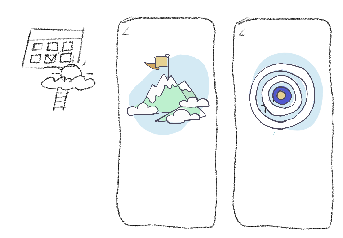
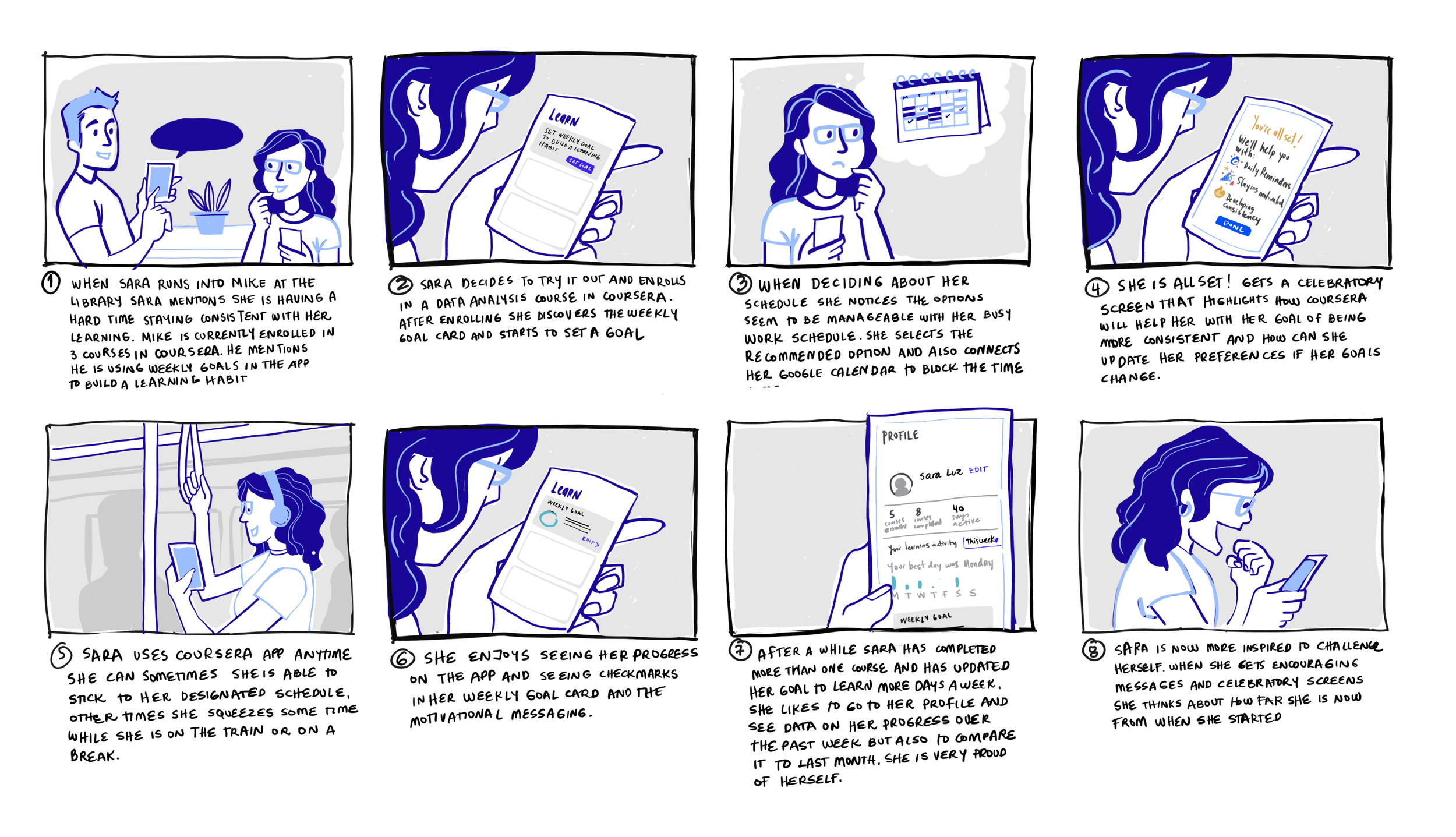
After the ideation session, I sketched initial concepts and discussed them with cross-functional partners and the design team. Based on the feedback, we created a storyboard to frame the conversation with our stakeholders.
The storyboard was inspired by research on mobile learners—their behavior, needs, and daily routines. Once we shared it with the team, we aligned on the requirements for the Minimum Viable Test (MVT) and identified features that we couldn’t tackle within our timeline.
MVT & Future Phases
To ensure a clear path forward, I organized a set of low- and mid-fi concepts that represented the Crawl, Walk, and Run stages of the feature’s evolution.
After finalizing the Crawl stage with our iOS and Android engineers, we were ready to move to Hi-Fi. The product designers and content strategists on my team took on user flows, UX writing, and new components for the design system, while I focused on creating illustrations for the celebratory screens.
One of the designers came up with two different options using existing native patterns and components. After gathering feedback from the squad and other teams, we streamlined the user flow by combining screens, reducing the steps needed to set up a goal.
Illustration Process
In the meantime I sketched and reviewed ideas for illustrations with design leads and marketing director. We had several reviews where we discussed color, animations and style. Coursera was going through a rebranding process so we decided to use the new color palette and use these illustrations to set the tone for any others in the future.


User Testing
Before moving forward, we conducted a quick user testing study. Collaborating with our PM, we defined the goals and scope of the study and partnered with my designer to write the user testing script.
The results were very positive. The feedback not only validated our MVT but also gave us ideas for future phases, such as allowing users to customize their goals, set preferred times of day, integrate calendars, and more.
Post launch metrics
+4.6%
from 2.59% to 6.59% number of classes completed
+5.4%
from 3.84% to 6.98% number of days active


