Elevating Wayfair’s product detail screen
The challenge
In early 2019, the Wayfair App team faced a critical challenge: our app's core experiences felt outdated, and we lacked that "appy-ness" that makes an app delightful and easy to use. We needed to give the Wayfair App a fresh, cohesive look that would make browsing through our 14 million products—ranging from chandeliers to customizable sectionals—a seamless experience.
Each of Wayfair’s four native apps—Wayfair, AllModern, Birch Lane, and Joss & Main—had its own brand strategy and design language. The challenge was to design a product detail page (PDP) that was adaptable, easy to scan, actionable, and delightful, all while maintaining the unique identity of each app.
Setting the strategic vision
I led the cross-functional team in defining the strategic direction for the new product detail screen. Our goal was to quickly reimagine the screen to be adaptable, easy to scan, actionable, and delightful.

User-centered approach
We started by diving deep into our users' minds. We conducted eight user interviews to understand their behaviors, needs, and pain points when interacting with the PDP. We wanted to see how they navigated our app and what could make their experience smoother.
Key Insights
-
Some of them were busy with kids or used the app during their lunch breaks or commute. They wanted to browse briefly and make quick decisions while completing other tasks.
-
They used search filters to narrow down their results to only see what fits their needs. They also used the images and specs information in the PDP to make sure the items were a good fit.
-
The purchase journey seemed different in length, approach, and context. Most of them agreed on the need to switch devices and/or channels during their journey, mostly for bigger items.
-
They spent a considerable amount of time looking at the images and videos, then a quick look at dimensions and product details. If not a fit, they would go back to Browse.
Competitor Analysis
Next, I conducted a competitor analysis. This helped us see how others in the market presented product details and identify best practices that we could incorporate into our own design.
Key Findings
Cross-selling & upselling
Competitors had between 0-6 cross-/up-sell carousels, but these were low in the hierarchy.
Persistent elements
66% of apps had some form of persistent element, typically featuring the Add to Cart CTA.
Micro interactions
Surprisingly, animations and transitions were minimal across the board, with only one competitor using a unique animation.
Collaborative Ideation
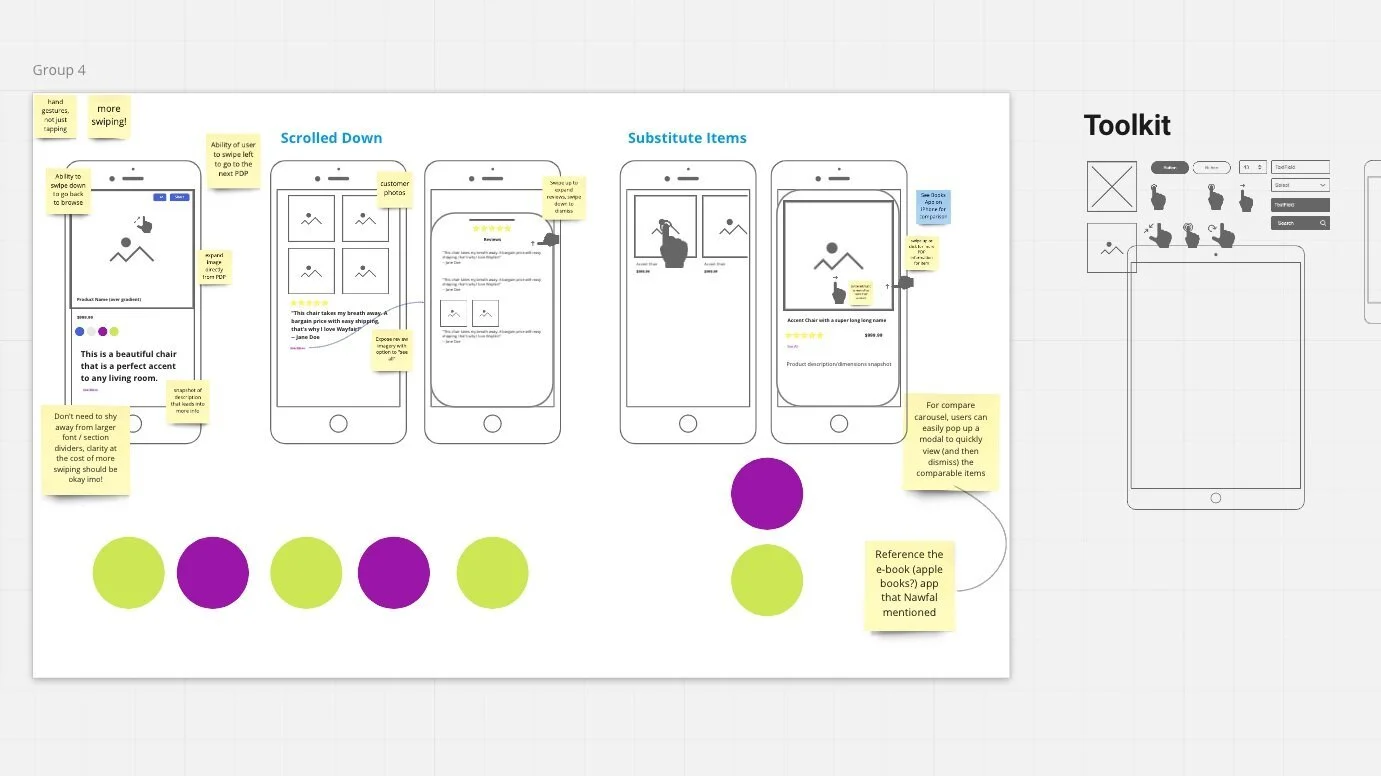
With our findings in hand, I led a collaborative ideation session with key stakeholders from analytics, product management, and content strategy. The goal was clear: reimagine the PDP to be intuitive, engaging, and true to our "appy" vision.
North star & phased approach
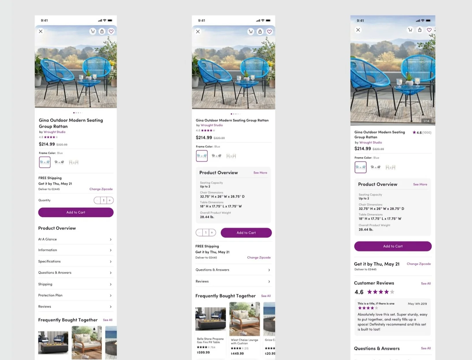
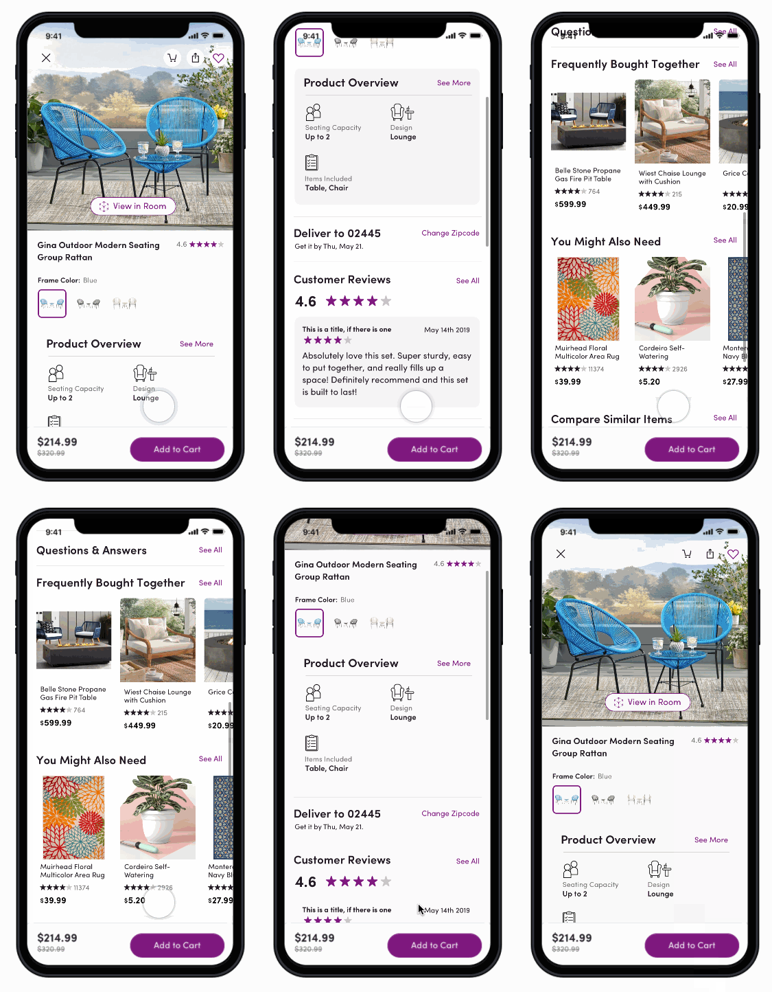
We aligned on a content hierarchy and layout direction, and I crafted the initial design concepts of our North Star. We decided to break down the full redesign into smaller, testable phases to prove the value of each change.
Crawl
We focused on the top of the screen, giving product images more real estate and relocating key actions like Share, Save, and Add to Cart for easy access. We also added a subtle "swipe to dismiss" animation for a smoother experience.
Walk
We introduced the "Product Overview Card" to help users quickly scan and decide if a product met their needs, displaying key information such as materials, specs, and dimensions.
Run (North Star)
Our ultimate goal was to create a fully cohesive experience that included the earlier features and introduced "Customer Review Cards" to highlight top-rated reviews.
User testing
Before moving forward with the various phases, we conducted usability studies to gather feedback. Based on user insights, we made minor adjustments, like including the product price in the sticky CTA and refining the Product Overview section.
Throughout each phase, collaboration was key. We worked closely with stakeholders, using tools like Abstract and Miro to capture and incorporate feedback, keeping our vision for the "Appy" PDP on track.


