
Ford, innovating the owner experience
Background
On the Experience Design team at VMLY&R, I had the opportunity to be part of the squad responsible for crafting a seamless Ford Owner Experience that would increase engagement across the Ford ecosystem (FordPass app, Ford Dealerships, Ford Owner and Ford.com) with established owners and help users to take advantage of all Ford Offerings.
Role
UX Design Lead
The team
UX & UI Designers, Content Strategists, Engineers, Product Owners.
The Challenge
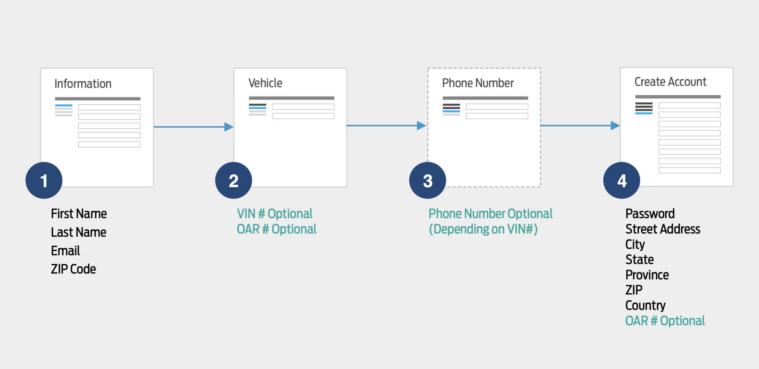
In order to unlock the unique experience we were building for Ford, customers had to go through the account creation process, which was generating a lot of friction for users. For the company, it was becoming very difficult to demonstrate the breadth of value that comes with Ford ownership as users dropped out of the process.
We learned through user research that Ford owners needed to understand what and why they are signing up, go through the registration process as quickly and smoothly as possible, and have the flexibility to finish the registration process when/where they want.
Approach
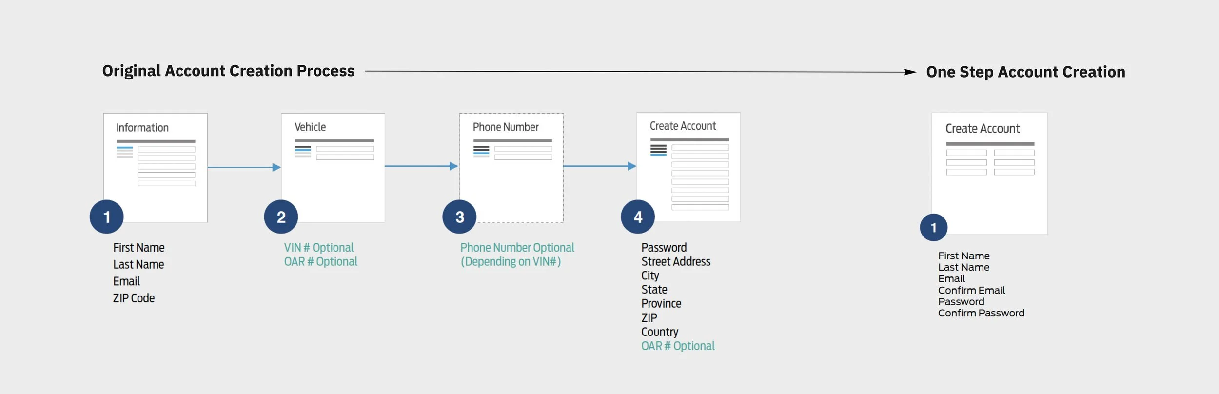
Data showed that only 3% of visitors registered during their visit, 8% of unregistered visits reached the Registration page, and 43% of users drop-off after Step 1, where they are asked for general information. Given these insights, I led the team using a three tiered approach: Single Sign on, Improve discoverability and Streamline Process.
Single Sign on
Users were experiencing frustration when attempting to use credentials from FordPass or Ford.com to sign into the Ford Owner site. Enabling them to use the same credentials would reduce time users spent in account creation and the business’ overhead of maintaining different sets of profiles for the same users. As a team, we aligned that we would need to accommodate account creation requirements from all three platforms, and discuss where in the user journey would make sense to ask users for this information.


Improve discoverability
We knew our users were not accessing the registration page as much as we wanted. Following the “out of sight, out of mind” mantra, we focused on making the sign-up form as visible as possible. We did this by:
Introducing key benefits of creating an account in the homepage.
Maximizing opportunities for users to register across the site.

Streamline the process
Research showed our users were experiencing cognitive overload when trying to create an account due to the large number of fields presented to them. We discovered that 33% of the fields were optional, but not all were marked as such. Our team proposed to reduce the required fields to a minimum and build a user profile gradually after the user had created the account.
Result
The results was:
A clean, simple, frictionless account setup experience that asks users to share only the most relevant information.
A hassle-free registration process that allows Ford owners to unlock unique content created for them.
A progressive profile creation approach that meets user needs of sharing additional information only when they want, and after they understand the value of it.